

- Project chart types - reusable chart types built for your project. You describe the chart you want, Lightdash builds it, and anyone in the project can then use it like a built-in chart type.
- Vega charts - a one-off chart written as a Vega-Lite spec in a JSON editor. The spec belongs to that chart alone.
Project chart types
A project chart type is a chart type you build once and reuse. Describe the chart you want - a calendar heatmap, a hexbin map, a custom KPI layout - and Lightdash builds it, along with the inputs it needs (for example a “Category” dimension and a “Value” metric). Anyone in the project can then pick it as a chart type, map their own fields to its inputs, and save the result like any other chart. The same chart type can power many saved charts, each with its own query and field mapping.Project chart types are an enterprise feature, enabled by default on Lightdash Cloud. Self-hosted instances need the data apps runtime configured.
Browsing chart types
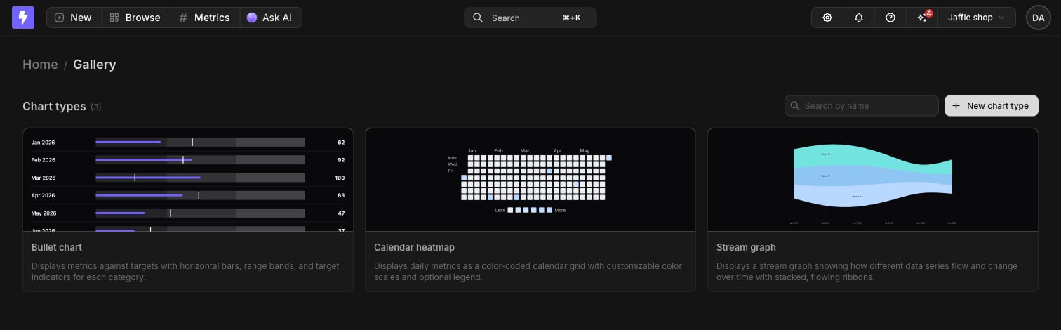
Every chart type in the project lives in the gallery. Go to Browse and pick Chart types. Each card previews the chart type with sample data. Click a card to see its description, who built it, its inputs, and its current version, and to preview it in the Explorer, edit it, or delete it.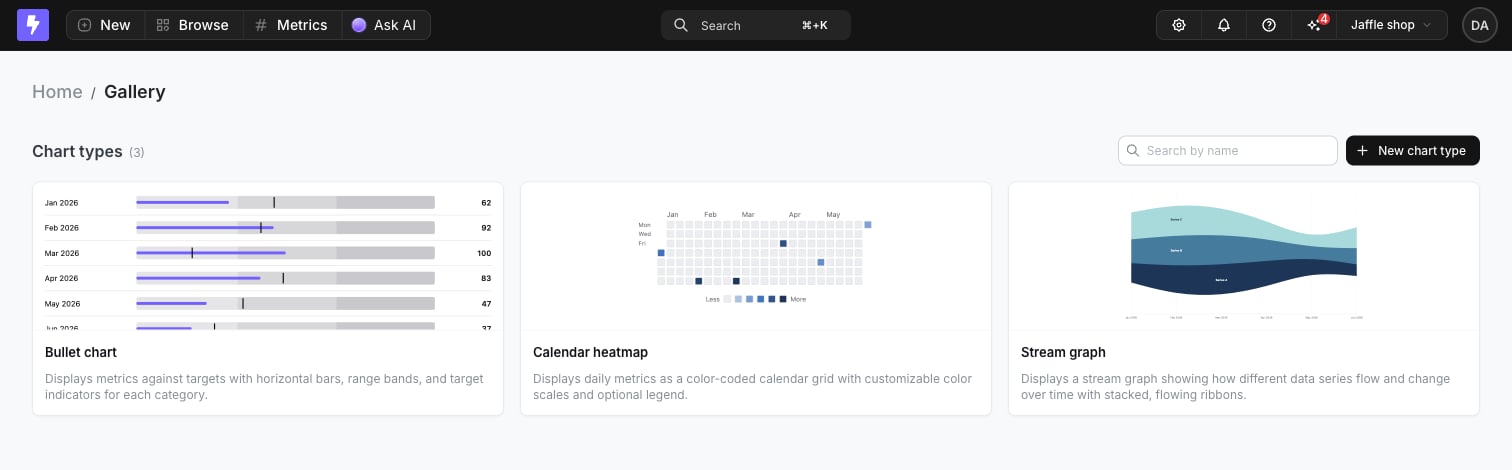
Building a chart type
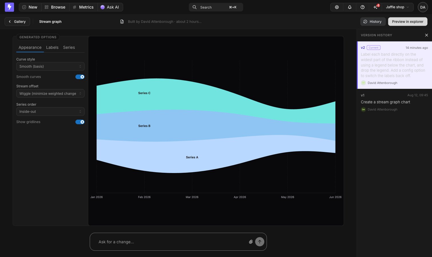
Click New chart type in the gallery to open the builder, then describe the chart you want. The builder previews the chart type with sample data as it’s built. The Configure panel beside the preview holds the display options the chart type declares, along with a color palette to preview it against. Follow-up prompts create new versions, and History opens a panel where you can view an earlier version or restore it. Name and describe the chart type in the header - that’s what people see in the gallery and in the chart type picker. When it looks right, click Preview in explorer to try it against a real query.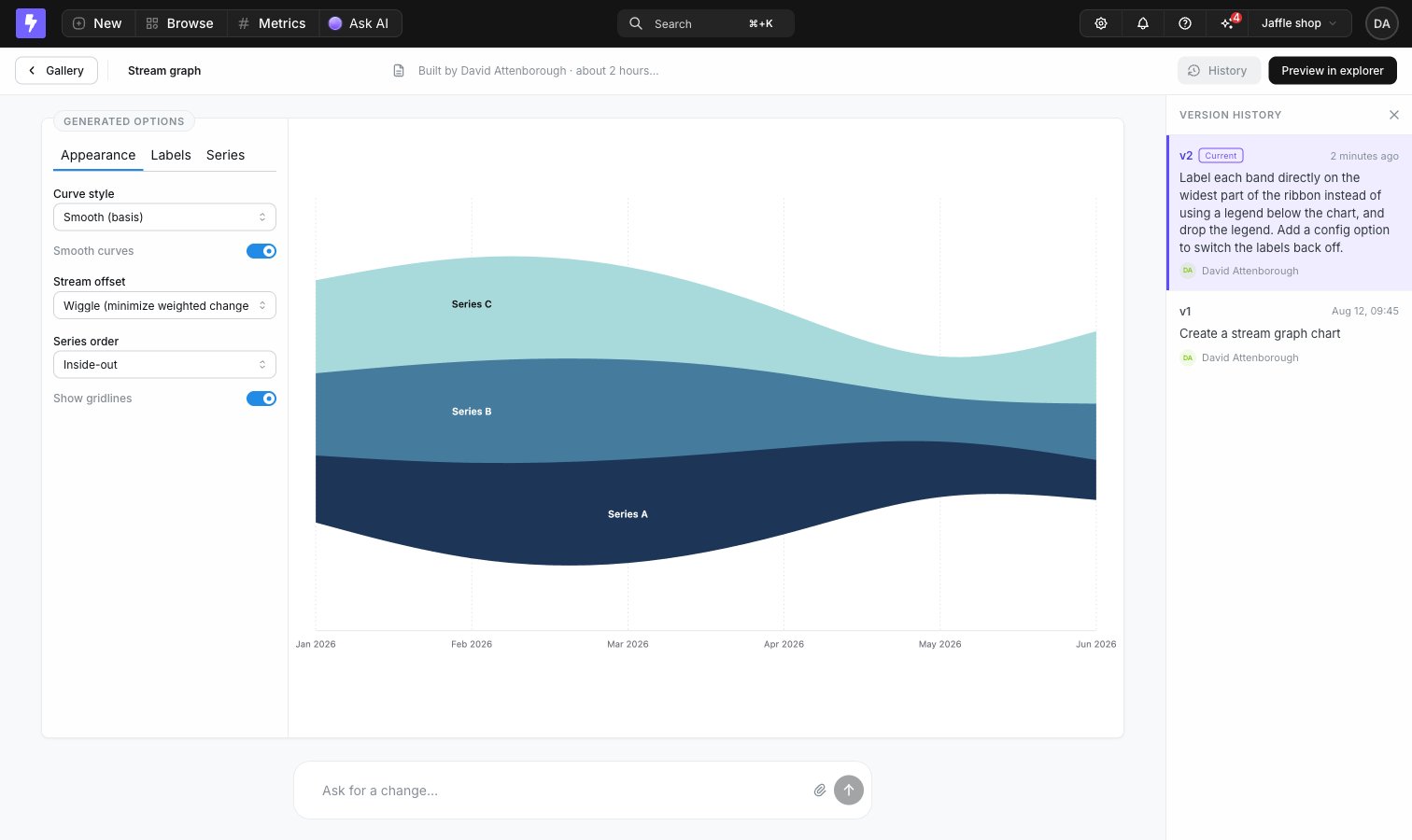
Using a chart type in a chart
1
Run your query
Select the dimensions and metrics your chart needs and run the query. You have to run it before you can pick a custom chart type.
2
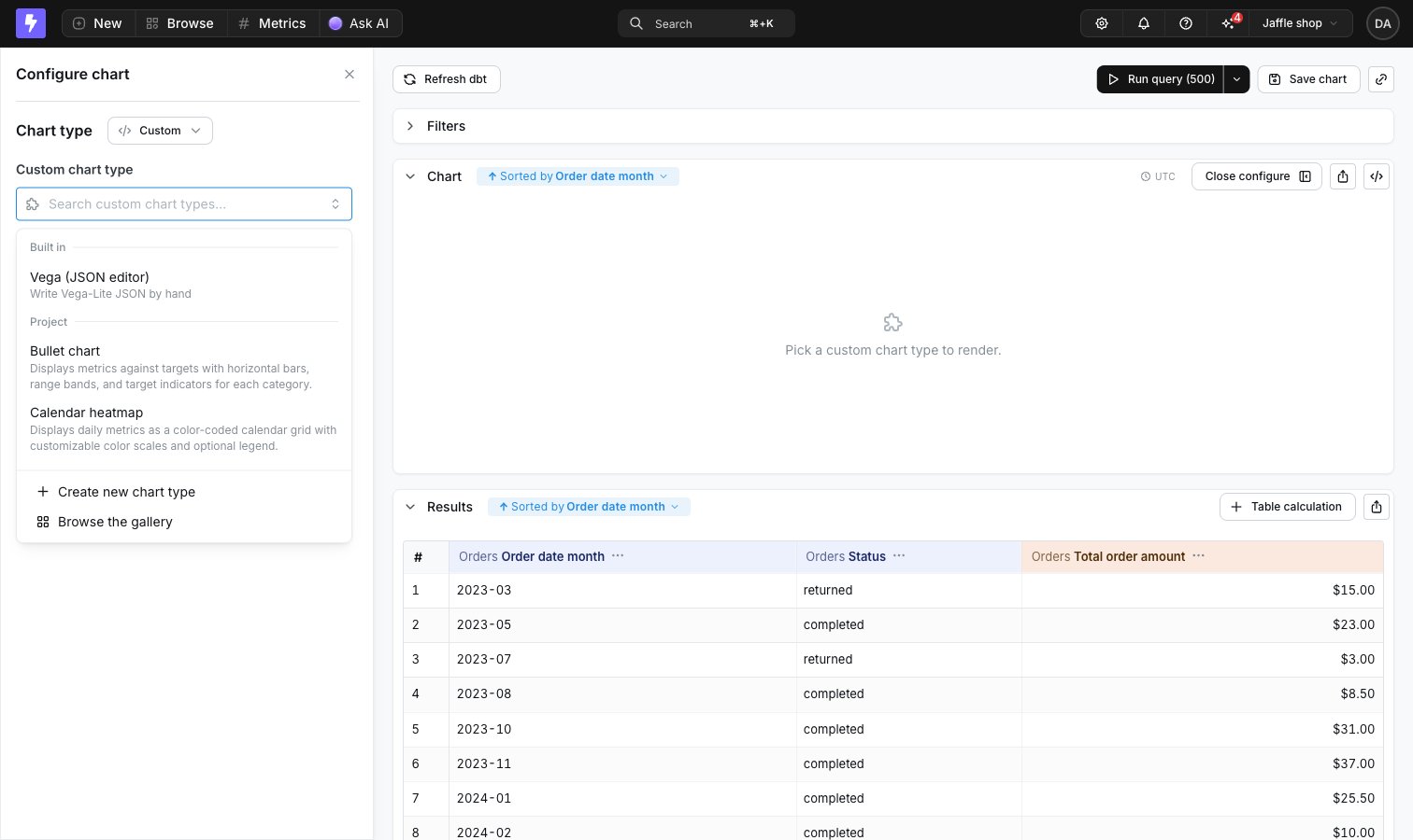
Pick the chart type
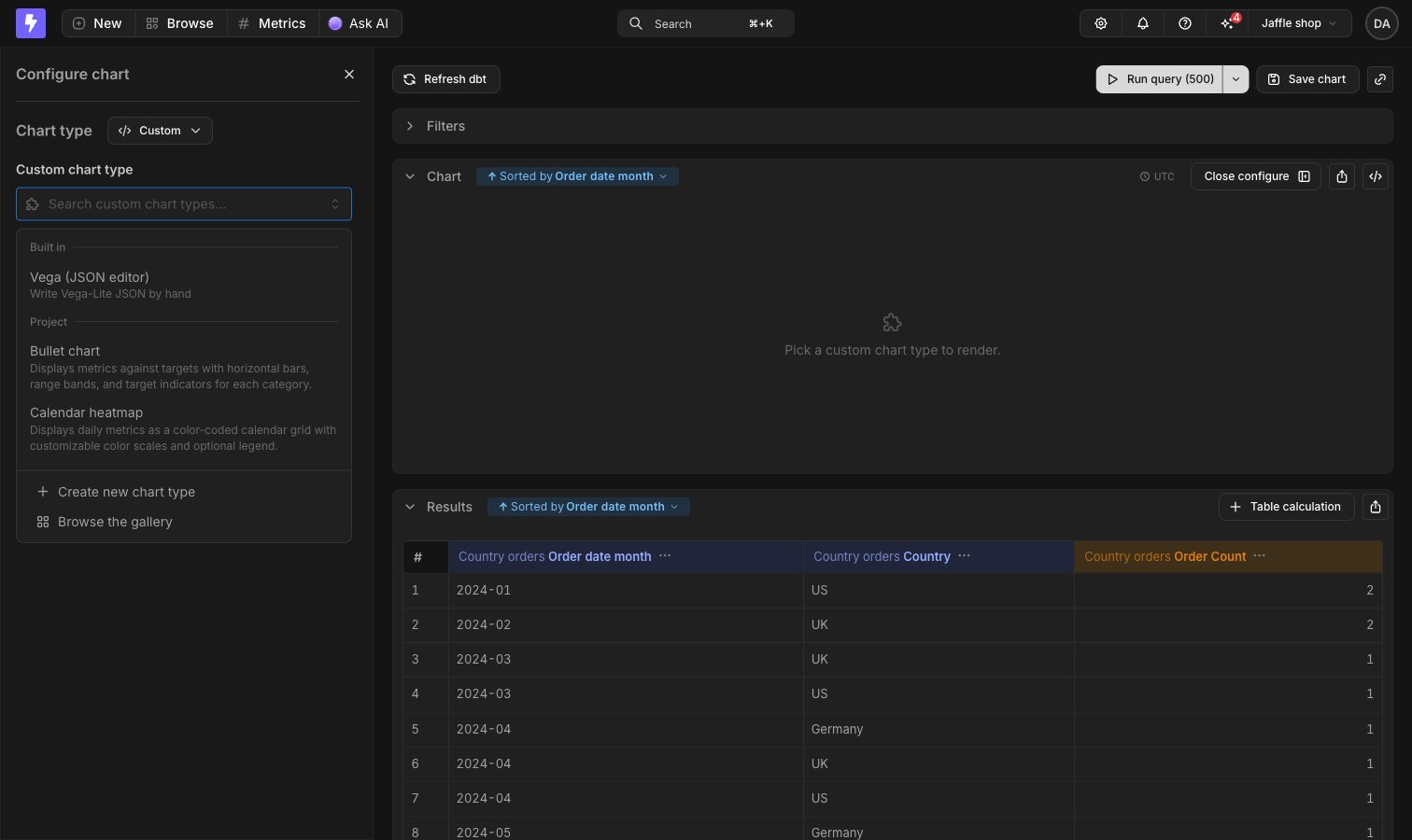
Open Configure, choose Custom in the chart type menu, then pick one from the Project group in the Custom chart type picker. Only chart types that finished building are listed.
3
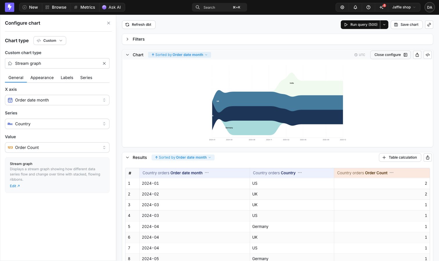
Map your fields
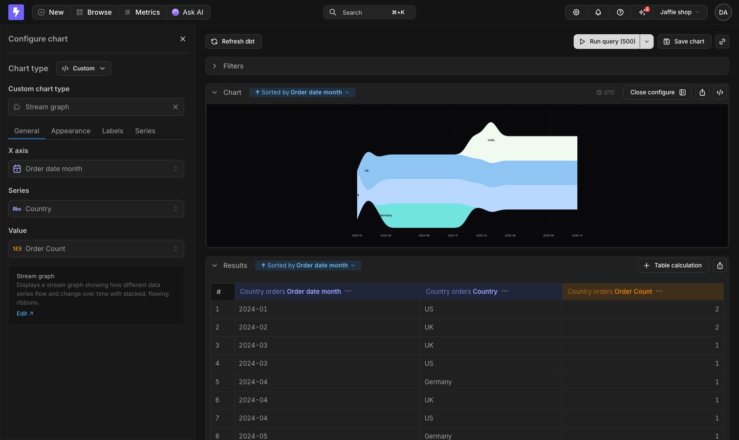
Each of the chart type’s inputs gets a field picker, the same as configuring axes on a bar or line chart. Required inputs can’t be cleared.
Saving and dashboards
Save the chart like any other chart. The saved chart remembers which chart type it uses and how its inputs are mapped. Saved charts render in chart view and as dashboard tiles, driven by each surface’s own query - dashboard filters and date zoom apply like any other chart tile.Permissions
Chart types are available across the whole project. They don’t live in spaces and can’t be moved into one.- Anyone who can view a chart can see the chart type it renders with.
- Editors and above can build new chart types.
- You can edit and delete the chart types you built. Project admins can edit and delete any of them.
Vega charts
Vega charts are written as a Vega-Lite spec in a JSON editor, which unlocks an extended library of charts including heat maps, bubble plots, box plots and more. The spec is saved with the chart and isn’t reusable elsewhere.Known limitations
These new Vega-lite powered charts offer enhanced flexibility and a broader range of visualizations, but there are important limitations to be aware of, particularly concerning interactivity and dashboard integration like:- Drill-Down Functionality: The ability to drill into metrics by grouping them with dimensions (e.g., “Drill by”) is not available in Vega charts.
- View Underlying Data: Users cannot click on data points within Vega charts to view the underlying records that compose those data points.
- Cross-Filtering: Interactive filtering across dashboard tiles by selecting elements within a chart (also known as cross-filtering) is not supported in Vega charts.
Quickstart
The steps to create a Vega chart are as follows:1
Gather your data
Return the data you need for your chart as normal using the Lightdash UI to select relevant dimensions and metrics.
2
Switch to Vega
Head to the chart configuration options and choose Custom in the chart type menu, then pick Vega (JSON editor) from the Built in group in the Custom chart type picker.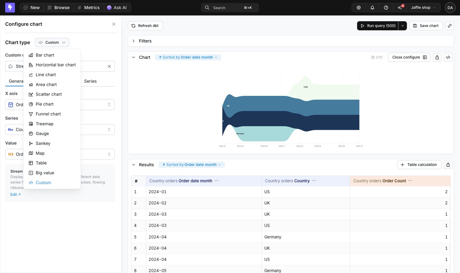
3
Write your config
Select a template to load a sample configuration for the chart selected, or grab an example.
Vega templates
Bar chart
You can already do this with presets in Lightdash, but it’s a simple example you should be able to get working quickly. This chart works best with simple string or date dimensions and a numeric metricHere is an example config with tooltips and a pivot
Here is an example config with tooltips and a pivot
Sankey-style bar chart
For true source-to-target flow diagrams, use the built-in Sankey chart. The custom template below is an escape hatch for the stacked-bar variation that shows how segment proportions shift over time on a continuous x-axis — something the built-in Sankey doesn’t do. Use this chart when you want to show how parts of a whole change across categories or time and you want to visualize how individual segments flow from one stage to the next. It’s perfect for things like user cohorts, funnel stages, or survey responses over time. Any scenario where it’s helpful to track how groups move or shift between steps. See a live demo of this chart on our demo site. The config below will output a sankey-style bar chart with the standard Vega-Lite settings, like this: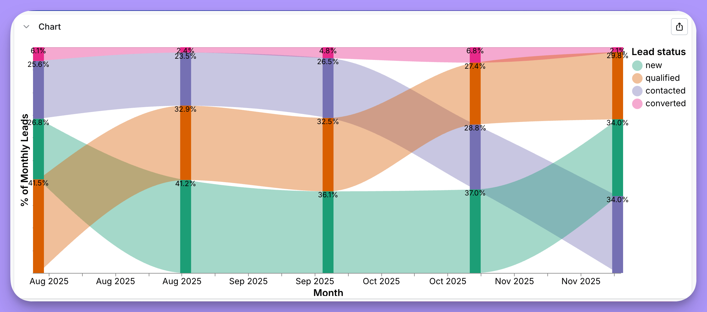
Example sankey-style 100% stacked bar chart config
Example sankey-style 100% stacked bar chart config
Line chart with confidence interval
This chart works best with a date dimension on the x-axis and a numeric metric as the “Mean” with “Mean High” and “Mean Low” numeric values in your results. See a live demo of this chart on our demo site. The config below will output a line chart with confidence interval bands that looks like this: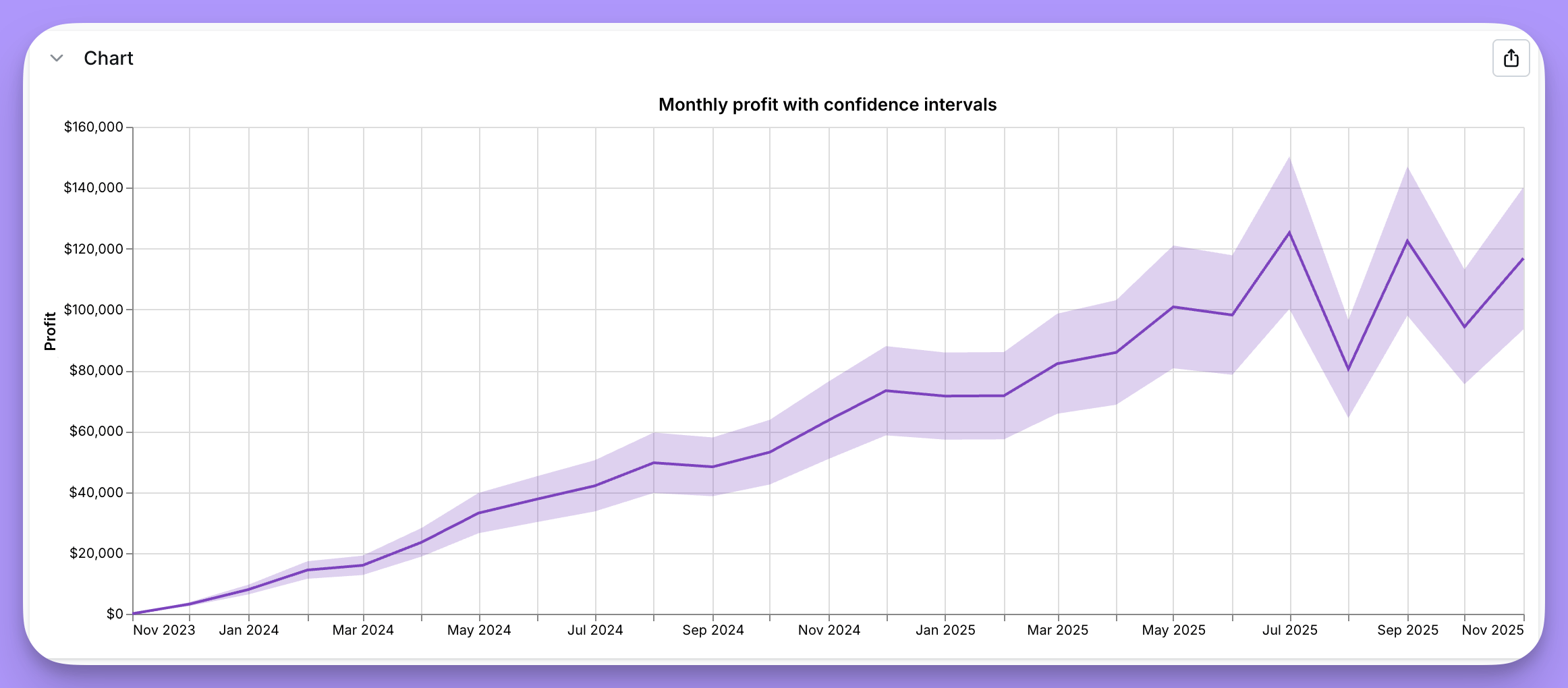
Example line chart with confidence interval config
Example line chart with confidence interval config
Heatmaps
Heatmaps are ideal for visualizing patterns across two categorical or temporal dimensions, making it easy to spot trends, hotspots, or anomalies at a glance. They’re perfect for analyzing time-based patterns (like day of week vs. hour of day), comparing performance across categories, or identifying correlations in multi-dimensional data. This chart works best with string or date dimensions and a numeric metric as color. See a live demo of this chart on our demo site. In this example, the heatmap uses orders data to show patterns across order weeks (x-axis) and days of the week (y-axis), with color intensity representing the number of orders. The config below will output a heatmap with the standard Vega-Lite settings that looks like this: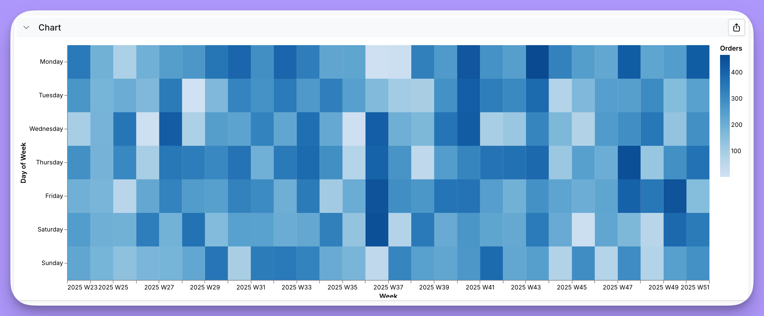
Example heatmap config
Example heatmap config
Bubble Plots
Bubble plots build on top of standard scatter plot visualizations, by allowing you to adjust the size of a given point based on the output of a field. Here’s one looking at some Healthcare data. This chart works best with string or date dimensions and a numeric metric for the y-axis and another numeric metric for the size. See a live demo of this chart on our demo site. The config below will output a bubble plot with the standard Vega-Lite settings, like this: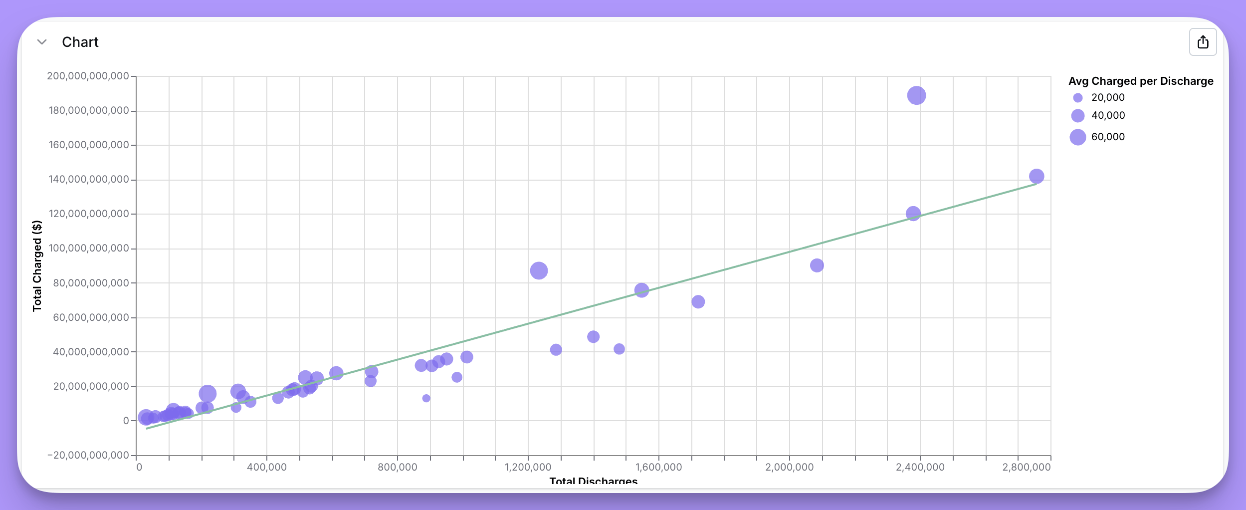
Example Bubble blot config
Example Bubble blot config
Funnel charts
For standard funnels, use the built-in Funnel chart — it handles discrete stages with counts and stage-to-stage percentages out of the box. The custom template below is an escape hatch for styled variations the built-in chart doesn’t support (e.g., custom trapezoid coloring, inline conversion-rate labels between stages). Funnel charts are ideal for visualizing a flow or process where the quantity decreases step-by-step, such as sales pipelines, conversion rates, or order processes. Each stage is represented as a bar whose width reflects the corresponding value. This chart works best with a categorical or string dimension (like status or step name) and a numeric metric (such as order amount or count) to measure at each step. Funnel chart configurations are more complex than other charts. We recommend loading the template directly in Lightdash, which will automatically map your data fields. See a live demo of this chart on our demo site. The config below will output a funnel chart with the standard Vega-Lite settings that looks like this: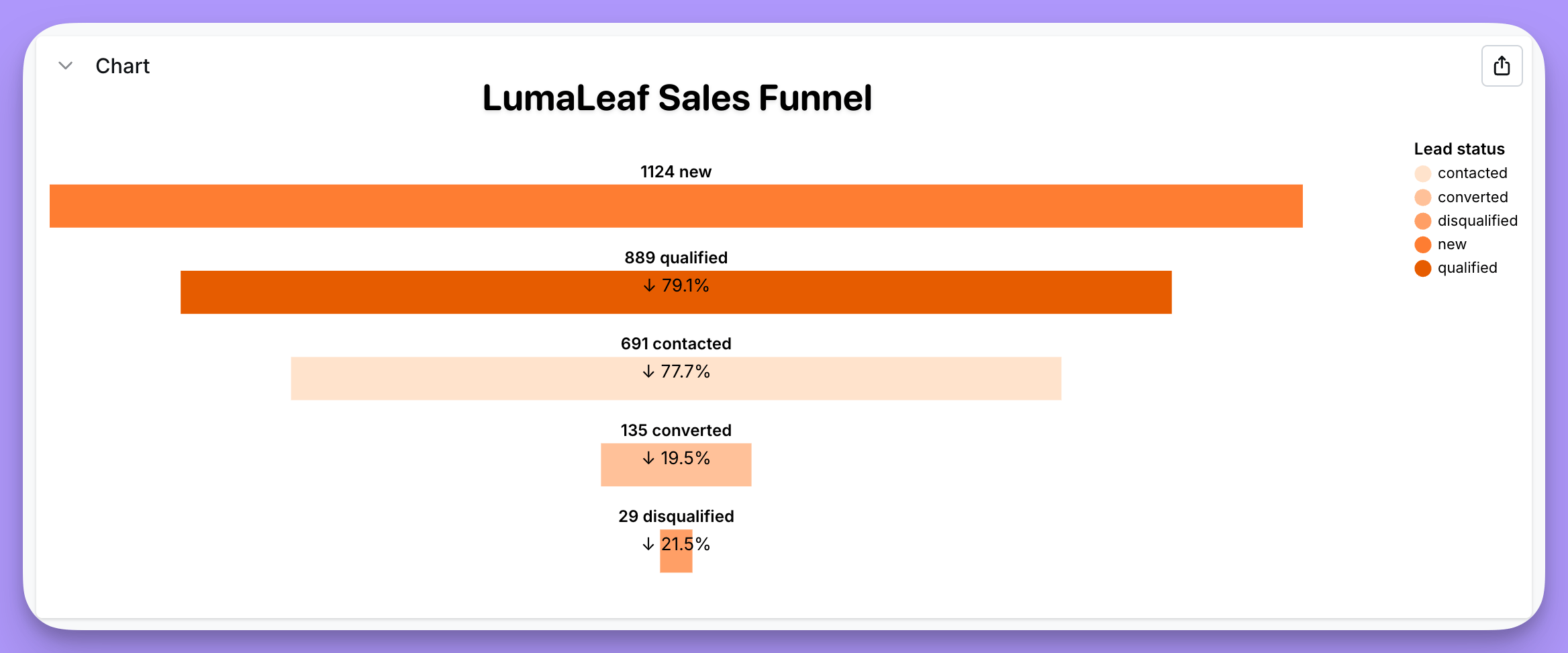
Example funnel chart config
Example funnel chart config
Waterfall charts
Waterfall charts show how an initial value is affected by a series of positive and negative changes, making it easy to see the cumulative effect of sequential increases and decreases. They’re perfect for visualizing financial changes (revenue breakdown, budget analysis), customer lifecycle metrics, or any scenario where you need to track step-by-step contributions to a total. This chart works best with a categorical or temporal dimension for the x-axis (like stages or time periods) and numeric metrics representing starting and ending values for each step. See a live demo of this chart on our demo site. The config below will output a waterfall chart with the standard Vega-Lite settings, like this: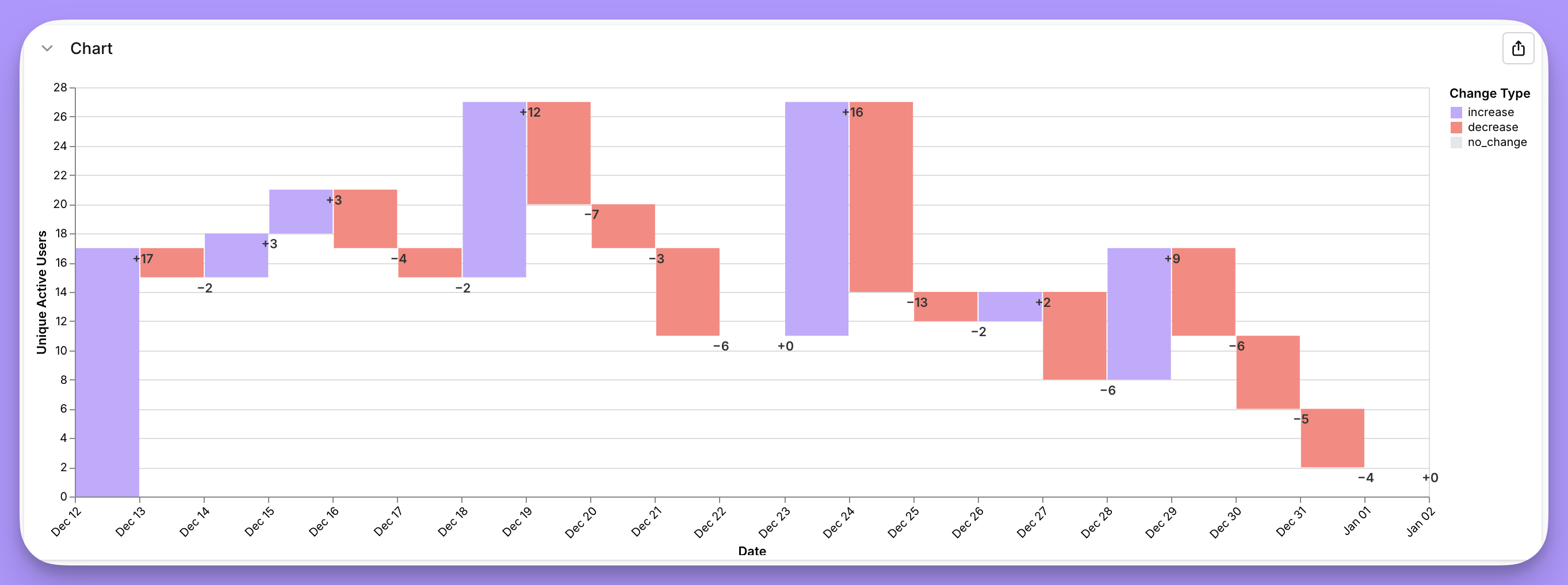
Example waterfall config
Example waterfall config
Trellis area chart
Trellis area charts (also called small multiples or faceted area charts) are perfect for comparing trends across multiple categories over time, making it easy to spot patterns, outliers, and seasonality at a glance. They’re ideal for analyzing product lines, user segments, marketing channels, or any scenario where you want to emphasize the shape of trends rather than exact values. This chart works best with a temporal dimension for the x-axis, a categorical dimension for faceting, and a numeric metric for the y-axis. See a live demo of this chart on our demo site. The code below will give you a trellis area chart like this: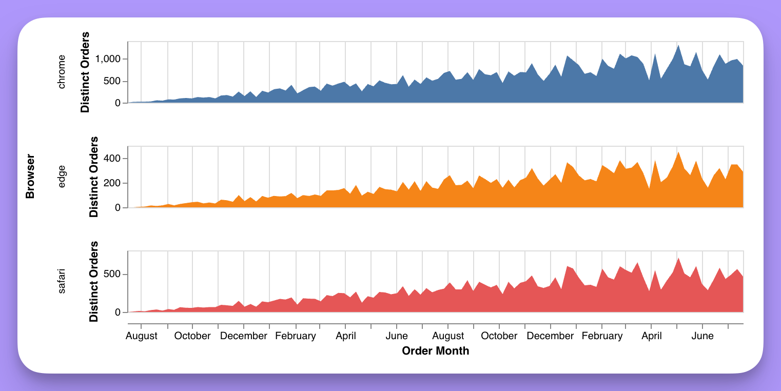
Example trellis area chart config
Example trellis area chart config
Highlighted bar chart
Highlighted bar charts are perfect for comparing a metric across categories while drawing attention to a specific item of interest, making it easy to see how one bar stands out from the rest. They’re ideal for emphasizing key accounts, top products, benchmark comparisons, or any scenario where you want to spotlight a particular category. This chart works best with a categorical dimension and a numeric metric. See a live demo of this chart on our demo site. The code below will give you a highlighted bar chart like this: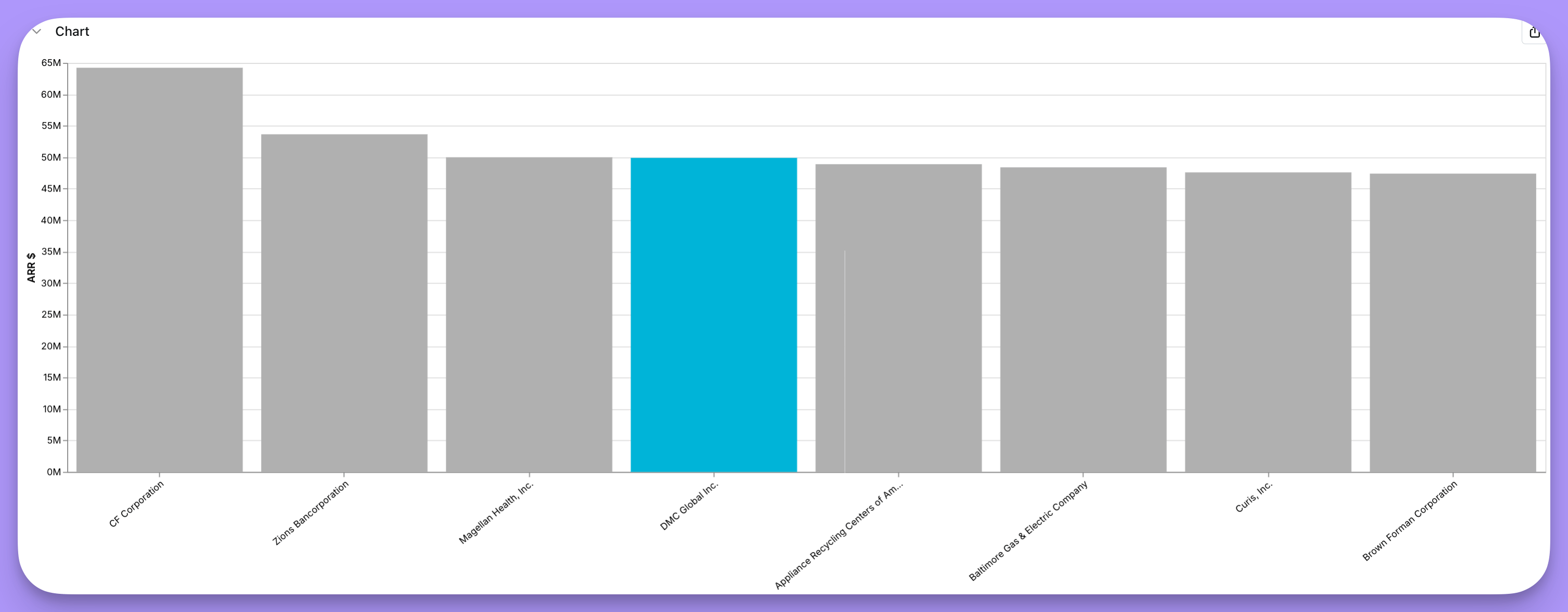
Example highlighted bar chart config
Example highlighted bar chart config